
Blog · August 21, 2026 · 6 min read
Mobile First Website Design: What Your Site Must Do Well on Phone
If your website isn't built for mobile first, you're losing customers before they even read a word. Here's what actually matters for phone users in the Riviera Maya.
- mobile-first-website-design
- riviera-maya
- playa-del-carmen
- cancun
- tulum
- quintana-roo
- website-development
- mobile-ux
- web-design
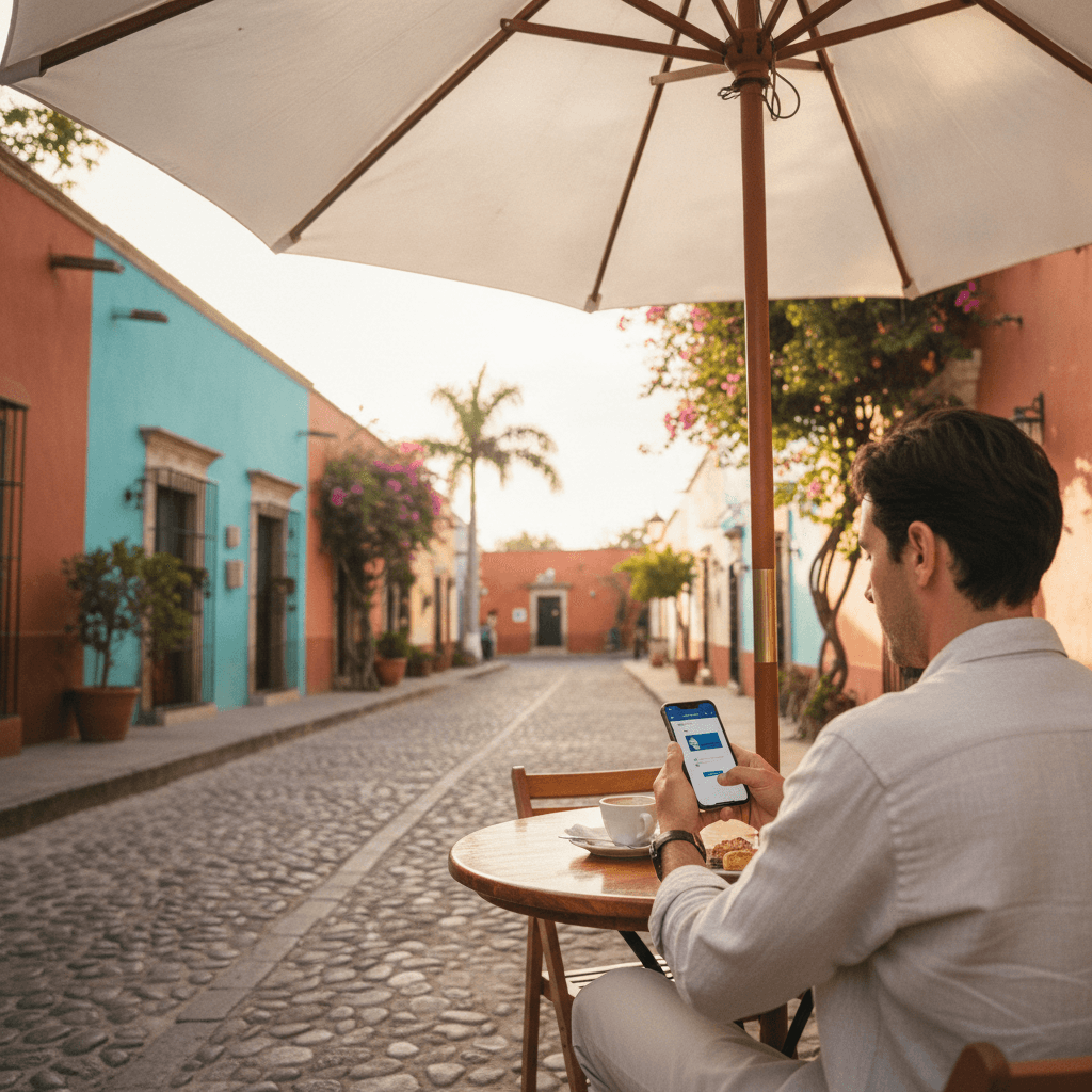
Walk along 5th Avenue in Playa del Carmen on any afternoon and look around. Nearly everyone has a phone in their hand. Tourists checking restaurant options, locals searching for services, real estate buyers comparing listings — almost all of it happens on a small screen.
This isn't unique to Playa del Carmen. Across Cancún, Tulum, and the wider Riviera Maya, mobile browsing dominates. If your website was built primarily for desktop viewing, you're working against the majority of your potential customers from the moment they land.
Why the Riviera Maya Is Especially Phone-Heavy
The region draws international tourists who are often navigating on roaming data, travelers who left their laptops at the hotel, and local residents who rely on smartphones as their primary internet device. Add to that a growing digital-first younger demographic, and you have a market where mobile isn't just common — it's the default.
This means your website isn't being judged on a large screen first. It's being judged on a 6-inch display, often in bright sunlight, sometimes on a slow connection, by someone who has three other tabs open and limited patience.
Building a site with mobile first website design means designing for that reality — not as an afterthought, but as the starting point.
What Mobile First Actually Means
Mobile first design doesn't mean you only care about phones. It means you design for the smallest, most constrained experience first and then scale up for larger screens. The result is a site that works cleanly everywhere, rather than a desktop site that gets squeezed into a phone.
In practice, this shows up in decisions like font sizes, button placement, image load times, and menu structure. A desktop nav with ten dropdown items becomes a nightmare on mobile. A large background video that looks impressive on a widescreen becomes a slow, battery-draining experience on a phone with limited data.
You can see how this ties directly into performance. If you've read our thoughts on website speed optimization in Mexico, you'll know that slow load times cost real business — and mobile connections make this worse, not better.
The Elements Your Mobile Site Must Get Right
Speed Above Everything Else
Mobile users are less patient than desktop users, and mobile networks are less consistent than broadband. A page that loads in two seconds on a desktop might take five or six on a mobile connection. Every extra second costs you visitors.
Compress your images. Avoid heavy scripts that block rendering. Use a reliable host. These aren't optional upgrades — they're the baseline for a site that doesn't immediately turn people away.
Tap Targets and Readable Text
Buttons need to be large enough to tap without frustration. Links grouped too closely together lead to misclicks and irritation. Text needs to be readable without zooming — a minimum of 16px for body copy is a practical starting point.
Think about your contact button, your booking link, your phone number. If someone has to pinch and zoom to find or tap any of these, you've already lost them to a competitor whose site is easier to use.
A Clear, Simple Navigation
Mobile menus should be collapsed by default and reveal only the most important sections. Your visitors in Tulum or Cancún aren't scrolling through six nested menu levels. They want to find what they need in two or three taps.
Prioritize the pages that matter most: services, contact, booking, or pricing. Everything else can be secondary.
Forms That Work With a Phone Keyboard
If you have a contact form or booking request on your site — and you should — it needs to function smoothly on mobile. That means short fields, appropriate keyboard types (numeric for phone numbers, email keyboard for email addresses), and a clear submit button that's easy to tap.
A frustrating mobile form is one of the fastest ways to lose a warm lead. Someone who was ready to enquire gives up because the form was too fiddly. Our contact form best practices guide covers this in more detail if you want to go deeper.
Images That Load and Display Correctly
Images should be sized and compressed for mobile delivery. Serving a 4,000-pixel-wide hero image to a phone is wasteful and slow. Modern image formats and responsive sizing can significantly reduce load time without sacrificing visual quality.
For hospitality businesses, tour operators, and real estate agencies in the Riviera Maya, images are essential for selling. But they need to load fast enough to actually be seen.
Common Mistakes on Business Sites in the Region
Some patterns come up repeatedly on local business sites that weren't built with mobile in mind. Horizontal scrolling caused by content that overflows the screen width. Pop-ups that cover the entire screen and can't be closed easily on a phone. Font sizes that require zooming. Menus that don't open or don't close properly.
These aren't just design complaints. They affect how Google ranks your site. Google's indexing is primarily based on the mobile version of your pages, so a poor mobile experience has direct SEO consequences as well.
If you're not sure how your site performs on mobile, Google's free PageSpeed Insights tool gives you a practical starting point. It shows you both performance scores and specific issues to fix.
How to Approach a Mobile First Redesign
If your current site is struggling on mobile, you don't necessarily need to start from scratch. Sometimes targeted improvements — image compression, switching to a mobile-friendly menu, increasing font sizes, fixing button spacing — can make a meaningful difference.
But if the site was built on an outdated framework or the desktop design is fundamentally incompatible with mobile display, a proper rebuild is often the cleaner path. A site built correctly from the start costs less to maintain and performs better across the board.
When working with a developer, ask specifically how they approach mobile design. Do they design mobile layouts first? Do they test on real devices, not just browser emulators? Do they check performance on slower connections?
If you're considering this kind of work, take a look at what we offer for custom website development — it covers what a professional mobile first build actually involves.
The Business Case Is Simple
Most of your customers in Playa del Carmen, Cancún, Tulum, and across Quintana Roo are looking at your business on a phone. If your site loads slowly, is hard to read, or difficult to navigate on mobile, those potential customers don't call, don't book, and don't enquire.
A site that works well on mobile isn't a technical luxury. For businesses in the Riviera Maya, it's the minimum standard for competing online. Getting it right means your site does its job — representing your business clearly and making it easy for the right people to reach you.
If you want to talk through where your site stands and what improvements would make the most difference, get in touch with us and we can take a look together.
Written by JMW Development · Based in Playa del Carmen
← All articlesKeep reading
More from the JMW Journal


Liked this article?
Want something like this for your business?
Book a free 30-minute call. We'll talk through what you are building and come back with a clear next step within 24 hours.