
Blog · August 10, 2026 · 6 min read
Website Contact Form Best Practices for More Inquiries
Your contact form might be the last thing standing between a visitor and a real inquiry. Here's how to get it right without overcomplicating it.
- lead-generation
- contact-form
- riviera-maya
- playa-del-carmen
- cancun
- tulum
- quintana-roo
- website-conversion
- cta-optimization
- small-business
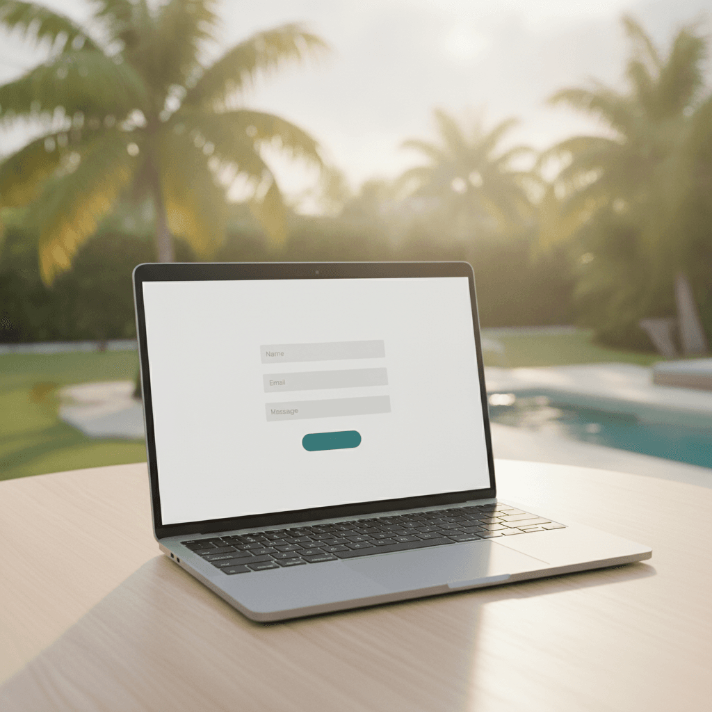
A visitor lands on your website, reads your services, and decides they want to reach out. Then they hit your contact form — and something stops them. Maybe it asks for too much information. Maybe the button says "Submit" and feels cold. Maybe the form just looks broken on their phone.
This happens more than most business owners realize. The good news is that small changes to your contact form and calls to action can make a noticeable difference in how many inquiries you receive. This post covers the patterns that work, particularly for businesses serving clients in Playa del Carmen, Cancún, Tulum, and across the Riviera Maya.
Why Your Contact Form Matters More Than You Think
Most websites in Quintana Roo are competing for the attention of visitors who are browsing quickly, often on a mobile phone, sometimes in a noisy cafe or between activities. If your form creates any friction — even a tiny amount — many visitors will just close the tab.
Your contact form is not just a utility. It is the bridge between interest and action. Treating it as an afterthought means leaving real inquiries on the table.
Keep the Form Short
The most common mistake is asking for too much upfront. Name, email, phone number, service type, preferred date, budget range, message — all on one form. That might feel thorough on your end, but it feels like a job application to the person filling it in.
For most businesses, three to four fields is enough: name, email or phone, and a short message or service selection. You can gather the rest once you are actually talking to the person.
What to ask and what to skip
Always ask for at least one contact method — email or phone, ideally both if your business model needs it. A short message or dropdown to indicate what they need helps you respond more usefully. Everything else — company name, how they found you, budget — can wait for the follow-up conversation.
If you serve an international audience, as many businesses in Cancún and Tulum do, consider making the phone field optional. Some visitors prefer email, especially if they are in a different country or time zone.
Write CTAs That Sound Human
The button at the bottom of your form is a call to action (CTA). Most forms default to "Submit," which is accurate but completely flat. It tells the person nothing about what happens next.
Replace "Submit" with something that reflects the next step: "Send My Message," "Request a Free Quote," "Book a Call," or "Get in Touch." These feel warmer and make it clearer what the person is doing.
Match the CTA to the offer
If your form is specifically for project inquiries, say "Start My Project." If it is for a free consultation, say "Book My Free Consultation." The goal is to make the button feel like a small, easy step — not a commitment to something unknown.
This also applies to the text above the form. Instead of a generic heading like "Contact Us," try something like "Tell us about your project" or "Let's talk about what you need." Small shifts in language reduce hesitation.
Make It Work Perfectly on Mobile
A large share of visitors browsing business websites in the Riviera Maya are doing so from their phones. If your form is hard to use on a small screen — fields too close together, buttons too small, text too tiny — many people will give up before sending anything.
Test your contact form on a real phone, not just a desktop browser in mobile preview mode. Tap through every field. Check that the keyboard doesn't cover the submit button. Make sure dropdowns and date pickers actually work.
This is part of what we focus on at JMW Development when building custom websites for businesses in the region. A form that breaks on mobile is not a minor issue — it is a direct loss of inquiries.
Show What Happens After They Submit
One of the smallest but most effective improvements you can make is adding a clear confirmation message after someone submits your form. A blank page or a generic "Form submitted" response leaves people wondering if it worked.
A better confirmation might say: "Thanks — we've received your message and will get back to you within one business day." This reassures the person, sets an expectation, and makes your business feel professional and organized.
If your inquiry volume justifies it, you can also send an automatic email confirmation. This adds another layer of trust and keeps your business top of mind while the person waits for your reply.
Place Your Form Where People Actually Look
Having a contact form buried on a separate page that requires two or three clicks to find is a real barrier. For service businesses in Playa del Carmen and across Quintana Roo, placing a short form directly on your homepage — or at the bottom of key service pages — tends to generate more inquiries than a standalone contact page alone.
You do not need to replace your contact page. Just make it easier to reach you from wherever someone happens to be reading. A persistent "Get in Touch" button in your navigation and inline forms on relevant pages both help.
If you are thinking about how your pages are structured to convert visitors, our guide on lead generation for websites covers the broader picture alongside the specific tactics.
Reduce Doubt Near the Form
People often hesitate before filling in a contact form because they are not sure what will happen. Will they get ten sales calls? Will their email end up on a list?
Adding a short, honest line near the form can help. Something like: "We reply within one business day. No spam, no pressure." This costs you nothing and removes a real mental barrier for cautious visitors.
If you have a physical location in Cancún, Tulum, or Playa del Carmen, listing your address or a phone number near the form also builds confidence. It signals that you are a real, reachable business — not a faceless website.
A Simple Checklist Before You Publish
Before your form goes live — or the next time you review your existing one — run through these questions:
- Does it have three to five fields maximum for a first inquiry?
- Is the CTA button written in plain, action-oriented language?
- Does it work smoothly on mobile?
- Is there a clear confirmation message after submission?
- Is it placed somewhere visible, not just buried on a contact page?
- Is there a short trust statement nearby?
If you can answer yes to all of these, your form is in solid shape. If not, even fixing one or two of these points can increase the number of inquiries you receive.
Getting Help With the Setup
Sometimes the issue is not knowing what to change — it is having the time and tools to actually change it. If your current website makes it hard to edit the contact form, or if you are not sure whether your form submissions are even reaching your inbox reliably, it is worth getting that looked at.
You can get in touch with JMW Development to talk through what your website's contact setup currently looks like and what might be worth improving. No pressure, no lengthy sales process — just a practical conversation about what would help your business get more inquiries.
Written by JMW Development · Based in Playa del Carmen
← All articlesKeep reading
More from the JMW Journal



Liked this article?
Want something like this for your business?
Book a free 30-minute call. We'll talk through what you are building and come back with a clear next step within 24 hours.